
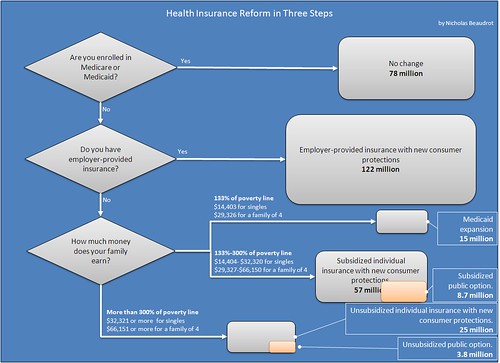
During the FDR 2.0 panel, an audience member asked Chris Hayes to give the condensed version of what the health care bills current under debate would actually do. He started his description by saying something like 'are you guys all familiar with flowcharts? ... right, we're all geeks here'. His description ended up being pretty useful. So for visual learners, I thought I'd make one:

Update: A previous version of this image incorrectly undercounted the number of Americans insured through Medicare or Medicaid. Donkeylicious regrets the error.
Update the 2nd: Continuing with regrettable errors, the final decision diamond was backwards, and suggested that rich people would get the subsidies. Obviously that's wrong. The current image is corrected.
Update the 3rd: Readers have made several suggestions. First, I replaced the FPL discussion, which is somewhat confusing, with actual dollar amounts. Second, I neglected to include the expansion of Medicaid to cover everyone earning less than 133% of the FPL. Third, I made the whole thing "granny-sized". There's a tension between producing something that can fit in a blog post, and something that's easy on the eyes of a sixty-five year old reader. So here's the latest rev. Click on the link for the full-sized image.
75 comments:
This is great, but one question for clarity's sake - shouldn't the "Yes" and "No" on the final diamond (re: poverty level) be switched?
It's the people who DON'T make more than 3X the poverty level that get the subsidized option, right?
Or am I just reading it wrong?
Shouldn't the bottom triangle be "Income below 3x the poverty line?"?
Great idea.....have go to put it on my site and on twitter.
I agree that they should be switched.
Nice job, but yes, those things are reversed.
Now lets TwitPic the sh** out of this thing.
Great job, Donkeylicious, except if you read your comments you'd notice that many of us believe your chart implies that those earning above 3x the federal poverty line will get subsidized insurance while those below that income level will NOT be subsidized.
Great chart! Shouldn't the Medicare box reflect possible improvements via the donut hole being reduced?
This is great!
I'd like to be able to send this to some older folks I know, but I don't think they'll be able to read the font size you used. Could you please post a larger version of the graphic?
I'll work on that. I tried to keep it small because I wanted it to fit on one page. Thank you!
Thanks. This really clarifies the plan. One q: What criteria determine who goes into the subsets of subsidized and unsubsidized individual insurance that are insured by the public option (the colored rectangles)?
might be useful to include this http://aspe.hhs.gov/poverty/09poverty.shtml
e.g. family of four = $22,050
3x's family of four = $66,000 family income
Poverty guidelines are nation-wide for the 48 contiguous states.
NICE WORK!
So wait, if I'm on employer insurance, I can't take the public option??? :(
thank you so much. This is so very helpful. I'll do my part to spread the word.
That's correct.
The earlier versions of the bills made it possible ... likely even ... that employers would drop their insurance and give their employees raises, and then they could buy the public option. But the versions being discussed now make that harder.
Just to clarify: Don't the subsidies cover those below 4x the Federal Poverty Line, not 3x?
"Just to clarify: Don't the subsidies cover those below 4x the Federal Poverty Line, not 3x?"
It depends on which bill you're looking at. One has 300% of FPL, and one has 400%. One I think has a number in between.
Kaiser already had the numbers for what percentage of the uninsured population is below 300% of FPL, which made it easier for me to produce the flowchart using that number.
What happens when employers decide to drop coverage for employees and just pay the Fed tax and shift them to the public plan?
A 7% tax is much cheaper for many employers than paying for health coverage.
Logan
If the public option covers fewer than 10 million people, why is it such a big deal for either the proponents or opponents?
I thought the whole point of this was to explain things in the simplest way possible? The second chart is not helping.
There's only one more box (the Medicaid expansion box) and one more arrow. I tried to make it look a little cleaner visually, that may help.
Also people seem to have trouble with the "is your income above/below" question, so I turned it into "how much do you earn". The money figures help because most people don't know what the federal poverty limit is.
How about just one box for the whole HIE, instead of separate ones for the subsidized and unsubsidized, and write inside it the income levels that are eligible for subsidy?
Here is a modified version with the boxes the same size, without text hanging outside of boxes, and with some numbers in the last decision diamond. I think this is less confusing.
Who pays for the new system and how much will it cost? Do we have enough primary care doctors to care for citizens under this new structure? Who sets up the payments to doctors and hospitals? Oh thats right. The US govt does. i.e. Medicare, Medicaid, and govt sponsored health insurance. More work, less pay. More people, less money. More coverage, less care.
Wait. What are you calling subsidized? As a self-employed person with no other options for health insurance I can deduct 100% of the cost of our health insurance for my family from my income on the front of Form 1040, even though my earnings are greater than 3x poverty level. I call that a subsidy. Are you saying that subsidy will go away? Or are you just excluding subsidies in the form of tax breaks from the discussion?
This is GREAT...but the population of the USA is >#300M...and your figures add to <#300M....
This is GREAT...but the population of the USA is >#300M...and your figures add to <#300M....
Bogus static analysis.
The plan makes it illegal to underwrite based on pre-existing conditions, and sets a federal 'minimum' standard for plans else, again, it is illegal to sell the insurance.
That means people can sit in a minimum standard plan, or the 'public option', then switch into any so-called 'premium' plan that is above the 'minimum' standard.
So any plan that offers more than the 'minimum', e.g., offers cancer, AIDs or end-of-life options that are better than the 'minimum', will get a run of transfers when morbidity arises, and quickly drive the plan into insolvency.
So the federal government controls health insurance and medical practice in the U.S. Game over, public option or not.
Wake up and learn a little about how private insurance works, apply those geek instincts, educate yourselves a little, OK? Sheesh.
I see the Anonycoward at 10:59PM has no faith in the capitalist pigs who run our private insurance companies. Here we have The Best Health Care System in All Universes! (TM) and, when faced with having to actually provide care to all sick people rather than the just sort of sick people, private insurers are suddenly going to go broke. This does not compute. Oh Wise Anonycoward, please grace us with your beneficent wisdom: How can this be The Best Health Care System in All Universes! if it is unable to take care of a significant minority of the population it serves?
Ever your loyal supplicant,
“More work, less pay. More people, less money. More coverage, less care.“
Does that mean the more disadvantaged people there are receiving the proper health care, the more advantaged people will receive.
That’s why it’s wrong- get it?
To exclude people from health care on the basis of income is uncivilized: simple, unlike the chart. Just say what it is in plain english.
Should it be this way, that way; maybe turn it upside bloody down. Would you give me a break.
I agree this is great. I had an initial confusion as to what the number in the block represented - dollars or people. I assume it is people. It would be be interesting to note the dollars in each block and their source - premiums, government, or trust fund.
To Anonymous at August 17, 2009 10:59 PM, "free markets" aside, not providing care due to preexisting conditions ultimately increases costs, through unpaid emergency room visits, lost productivity as folks try to find alternative care, etc. Providing a health "option" is important especially if the private sector won't. Health co-ops are not national. What solution do you propose that addresses our health care problem? Do you even think there is a problem? IMHO, the private health insurance hasn't worked for a great number of folks and as yet, free markets hasn't corrected it...
Actually I think the version the NY Times is the most powerful, your latest rev is getting pulled into the weeds.
This is quite wonderful! any chance you can post a link to the orginal slide, or pdf version of the slide? This would enable the slide to be 'blown' up and retain crisp font readability.
Kudos for the visual summary of a currently murky public debate. Murky is scary, and frightened people don't think clearly;)
How about adding some transparency to the orange boxes so we can see the underlying text?
The "Granny Size" chart lacks "Yes" and "No" from the diamond at lowest left.
Nick, I don't want to beat this to death, but the chart doesn't show what criteria, if any, determine how someone goes into the subsets of subsidized and unsubsidized individual insurance that are insured by the public option in the last two boxes. There is one arrow going into each box, each with two possible outcomes (e.g., both subsidized individual and subsidized public are in the same box) and no decision diamond showing how the insured person gets into one or the other plan. Is it that the insured person makes the choice of private or public at this decision point? If it's some other reason related to income or work status, there should be two more decision diamonds with arrows going into their own public option boxes (which should be removed from the individual insurance boxes). Again, if the person to be insured freely makes the choice, then the chart is correct as it stands; otherwise, it should be expanded to include all decision points. Can you clarify this point? I just want the chart to be bulletproof. Thanks for your terrific work on this.
Uh....Huh?
How about a flow chart for single payer?
This chart is perfect descri[ption of a point in time, say, "day one". Unfortunately, on "day two", many employers would drop their employer-sponsored coverage because of the incentives to do so established by the plan. There are lots of other transaction costs you do not account for that would change all your enrollment numbers around significantly.
But the chart is a great representation of a proposal no question. Good job.
For the person asking above about tax deductions vs. subsidies - I can't say for sure, but if someone was going to eliminate the personal health insurance deduction I'm guessing we would have heard about it twice - once due to the outrage it would cause among the self-employed, and once again because it would save so much money that it would make hcr less of a deficit threat.
My impression is that the self-employed health insurance deduction will remain. That's not a subsidy, really - it's just that the government doesn't count what you spend on health insurance as income, any more than what you spend on office space, equipment, advertising, or inventory.
The "subsidies" in the bills come in the form of tax credits which are applied directly to your tax liability (a la the earned-income credit). If you owe less in federal income taxes than you are supposed to receive via the credit, the extra amount will come as a refund.
If I'm wrong, then somebody please correct me.
where do the "insured" numbers come from? this chart suggests a huge exodus from employer-sponsored health insurance to the individual market.
please provide a link to the underlying data.
You should create a third chart, the flowchart for how things will be if we go with the status quo - keeping things as they are. Alternatively, you could call it the "Republican Inspired Health Insurance Reform Flowchart" or something like that.
Thank you for this! It's simple and easy to understand. I hope more Democrats will pick this up and use it.
You are missing veterans, which get their medical insurance/service through the VA. From what I can find, there are around 25 million of them.
At the bottom diamond, the numbers add up to 82 million people. That's people not on Medicare, Medicaid, or employer sponsored health insurance.
Does that mean there are now actually 82 million uninsured? How come everyone in the media uses numbers from 45-50 million uninsured?
NealB: it means that 50-55 million people currently buy individual health insurance.
Employers provided health insurance to 177 million people in 2007. New data will come out September 10th.
This chart shows 55 million losing employer coverage. That's a huge benefit dump onto the individual, with the government picking up part of the tab for low income people in 2013
U.S. active duty and retired military and their families all have free to low-cost medical benefits. This is addition to the VA hospital system for veterans.
"Employers provided health insurance to 177 million people in 2007. New data will come out September 10th"
Can you please post a link to that report? I have been unable to find an exact number of people with employer-based insurance and had to work it out from percentages (70% of workers have employer-based coverage).
US Census Bureau:
The number of people covered by employment-based health insurance, 177.4 million, was not statistically different from 2006.
http://www.census.gov/hhes/www/hlthins/hlthin07/hlth07asc.html
New numbers due out Sept. 10. They normally come out in mid to late August. The Obama team pushed them back this year.
This flowchart implies a straw man - that people disagree with health care reform because of the general proportion or flow of money - and that when it's made clear to them they'll just say, "Oh, that seems ok."
In actuality, the points of contention for those opposed to this reform are more like this:
1. We have a general mistrust that systemic changes won't upset the balance of the system (i.e., why should we believe that tweaking one area wouldn't affect the others?). For example, high private costs subsidize the (artificially low) federal plans. How does that work when an increasing portion of people go onto that plan? And so on.
2. If it's that simple, why a 1000+ page tome? We have a mistrust that the lawmakers understand this bill (or really the multiple versions floating around), we know there are untold billions at stake (which WILL draw lobbyists, etc.), and we're fearful of hurrying up such a massive change.
3. Specifically, it is common sense to mistrust that the 122 million person "employer-provided" bubble will stay the same. Most of us believe that we won't have "choice," but will instead be pushed eventually into government-run health care, either by intent or through market forces, as private companies fail to compete with an entity that can ignore or change the rules.
Finally, you guys loved the insanity of people like Cindy Sheehan and Code Pink and rioting G8 protestors who were ACTUALLY violent, and all of the whole "Kill Bush" cult, and it is unbelievably hyperbolic to call these town hall protesters an angry mob by comparison. You know that for every Obama Hitler sign there are HUNDREDS of normal concerned citizens. Calling the other side names suggests not only incivility on your part but also a lack of willingness to discuss the real issues.
The part I see NO explanation of is... the effects on EMPLOYERS. Elementary economics will show that if it costs an employer more to insure/subsidize insurance for a group of employees, the number of employees will SHRINK. If I were a business barely getting by, and I had a choice of paying 20% more (fictitious example) to insure my 6 employees, or paying higher unemployment taxes plus some overtime to 5 employees, I'm betting my chances of staying afloat are better eliminating that one unfortunate employee. What so many people do not seem to get is BUSINESSES AREN'T RICH. Some individual or group took on the risk of building a business and invested their life savings. Some much larger group decided to work for them, trading their autonomy for stability. Somewhere along the way many of these people convinced themselves they deserve more XYZ, health care, vacation, smoke breaks, longer lunch, company car, ergonomic chair, dental plan, vision plan, child care plan, retirement plan, company stock, drug plan, public transit plan or credit, etc. And those rich companies should pay for it.
KIT, you are 100% correct & I appreciate your effort to educate the Ozombies. Just to back up your correct analysis of the 122 Million on employer sponsored plans, I employ 17 people who will be going to the public option even if I have to pay the penalties being discussed. I can't imagine the private insurers having any chance to compete with the public plans.
When the 122M switch to the bottom of this insane flowchart, what will be the cost of ObamaCare? What will our defecit be?
--NOISE
what about vetrans?
The claim that Medicare is unchanged is false, afaict. Obama has made ending Medicare Advantage and filling the donut hole central points, no?
Let's just stop with the first diamond. 800 pages of the 1000 page HR3200 are devoted to Medicare and Medicaid. Are we too believe that these clauses were crafted so that there would be no change? Hardly. Especially when the IMAC mechanism to be introduced to Medicare has the explicit policy goal of cutting Medicare costs while insulating Congress from political pressure with an unaccountable and non-transparent board, a la the base closing commission.
So, no reason to go with the rest of the flow until the first diamond gets straightened out, right? "No change," my sweet Aunt Fanny.
Medicare/Medicaid covered 78 million in 2007.
While a new box was added for additional Medicaid enrollees, there is no increase for Medicare, which has aging baby boomers on the way.
Thanks so much for this. That flowchart is fantastic.
We were there filming that panel and posted a clip of the exchange that "inspired" this flow chart: http://www.youtube.com/watch?v=R2aV6uJGkP0
Wow, I am worried about the numbers for the subsidies. $66K for the family cut-off? That's higher than the median family income in the US!
Now I'm sure that the subsidies are inversely related to income, but that is a lot of families that will be receiving a subsidy. How do they expect to do all that for a trillion over a decade? Look how Plan D is nearly twice what the Bushies estimated it would be. We don't want to make that mistake again.
And the person who raised a concern about the employer heath care is right. We can't say "we need to do this because we have to relieve American business from the burden of employer-provided health care to improve our international competitiveness" and "we don't expect any of the 122 million people now covered to be affected".
That makes no sense.
I decided to make a derivative based on this but in a slightly different format showing #s of people as thickness of lines. Who Will Get What?.
I expect that the big difference in employer coverage numbers between 122 million and 177 million is between 122 million enrollments and 177 million people. Many enrollments cover more than one person.
Nicholas-
Love the flowchart and have already Facebook-status-updated it to the fomenting masses. Some suggestions/requests:
1. Add a "No change" to the "Employer-provided insurance" terminal (to reinforce the fact that private insurance isn't going away).
2. I think you need to work the word "private" into the "individual insurance" terminals (to reinforce the fact that private insurance isn't going away).
3. Adjust the Medicaid expansion terminal to reflect the change from the status quo, e.g. "Medicaid expansion from 49M to 64M", or by percentage.
4. Add "VA" to the first decision in addition to Medicare and Medicaid.
Thanks again!
Oh-- and perhaps call out to show that illegal immigrants are excluded!
Sorry Anardakos, your comment makes no sense. Family coverage applies to individual buying private plans, just as it does to employer provided health insurance.
Who publishes a chart mixing operation definitions? A hack would.
The numbers roughly total our U.S. population.
The author of the flowchart asked for a link for employer sponsored health insurance numbers.
That's another clue that the projections are suspect.
This reform makes no sense to me. The people it is supposed to help are those with no insurance. I'm one of those people. I fall in the >$66k family of 4 with no insurance category, and I don't know where I'm magically supposed to get the extra cash to pay insurance premiums.
I would love to have insurance, but I simply don't have the money. And from what I understand, if I don't have the money, I will be fined for not buying insurance - making my financial situation even worse!
So one segment that this is reform is supposed to help - the uninsured middle class (me) - are the ones getting screwed by this.
This seems like some sort of Catch-22 nightmare. I never thought of myself as a blue dog before, but I guess I'm becoming one.
This is an excellent visualization of a complex issue. Upon which bill is this based? Thank you.
Health Insurance Coverage Reform Flow Chart
Thank you for your terrific and very hard work! Would you identify the particular bill this represents?
I am a Healthcare Advocate (www.healthcareadvocate.org). May I your permission to post this on my site.
Thank you
Thank you.
Anonymous wrote: >>>>>The claim that Medicare is unchanged is false, afaict. Obama has made ending Medicare Advantage and filling the donut hole central points, no?
August 19, 2009 7:09 PM
Yes, Medicare Advantage would be CUT, hopefully.
25% of seniors (wealthy & upper middle classes) are enrolled in Medicare Advantage, an INSURANCE program which offers additional benefits to the standard Medicare.
Taxpayers fund Medicare Advantage to the tune of $180 BILLION.
imo - if seniors want more coverage than standard Medicare - they should pay for it themselves!
Since 2004, Pelosi & Dems have complained about the Donut Hole and insisted if Dems controlled Congress, they would FIX IT.
ha!
Now - supposedly, Obama has made a deal with Pharma which includes NO CHANGES in the Donut Hole.
Two questions:
If I like my employer's plan I can keep it. Sounds great.
But what if I lose my job? Can I stay on my (now former) employer's plan by paying the premiums the same way I can do so now under COBRA?
If I change jobs, can I sign up for my new employer's plan?
Where are you getting your poverty level figures from? Are those the numbers on the actual bill?
Commenters on other blogs with your chart posted to it have inferred that 3x the poverty level=rich. As someone who makes barely above 3x the poverty level, with no college education, that's not rich. At least not in the part of the country I live in. Having to buy into a private health plan or public health plan with no subsidies could be a bit of a financial stressor.
This is beyond my vision--in several ways. However, I know that if there are not drastic changes in favor of the consumer, I will be priced out of health care insurance and will have to make choices between perscribed medicines, "insurance," and a continued middle-class life style. As a country responsible to its citizens, every person should have access to medical care, or Medicare. Carl C.
This is just another step to one world goverment !!!!!
VERY CONCERNED CITIZEN
Why is it that no one can actually explain the health care reform. So many try but it just becomes more confusing. I am a rep. and I know by what I have read and heard that I want nothing to do with this take over. Like I said before, this is a step toward one world gov. which I do not like or want.
Still another concerned citizen.
Post a Comment