

Don't get too excited about this map, though, because of course lots of counties were going to see an increase in votes for Obama over John Kerry. After all, he won by 7 percentage points while McCain. Instead we should look at whether the county's level of Republican support is growing slower or faster than the electorate as a whole.

- The Pacific Coast and inland counties in Pacific Coast states, despite not campaigning there at all during the general
- Heavily Hispanic regions of the Southwest
- The Upper Midwest, which is to say, the Great Lakes states outside of Ohio and Pennsylvania
- The Acela corridor (Obama saw "declines" in Massachusetts, probably because Kerry had been the candidate in 2004).
- A number of counties in the Eastern half of Virginia and North Carolina. Note that these gains extend beyond the former tobacco plantation counties that have fairly large African-American populations.
- Counties with large African-American populations in the Deep South
- Almost every major city.
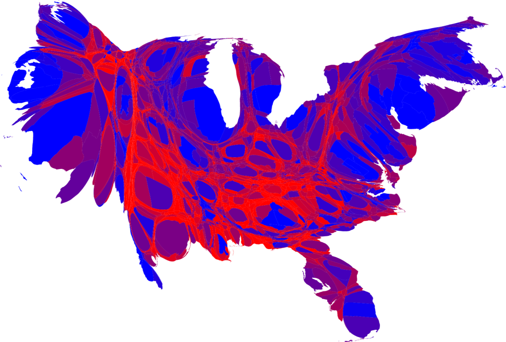
But the map we're going to hear a lot about is this one. It's just the raw Obama-McCain map from 2008. As you can see, despite seeing substantial shifts towards Democrats in almost the entire country, much of the land area of the country consists of sparsely populated plots of land that are extremely heavily Republican.

This map is only going to look worse on Wednesday. We're already starting to hear about the lack of a "mandate" unless Obama wins more white dudes. That critique will be amplified by the critique that somehow, because all of Obama's majority is heavily concentrated in a small number of counties, he's somehow not actualy the President of the whole country. This is, of course, bullshit, but when has that ever stopped anyone in politics?
If you resize the counties so that more populous counties look larger, and the reverse for small counties, you get a somewhat fairer picture of the result. Here's one from that guy at the University of Michigan who makes these maps every election cycle:
No comments:
Post a Comment